Back of house · Swiggy Dineout
Building a unified partner system
One app where restaurants on Dineout handle bookings, the digital menu, bills and payouts.
In short
- The gapBookings and the digital menu were only on a web dashboard, which many restaurants don't use. Bills and payouts weren't anywhere.
- What I builtOne partner app, on phone and web. I designed Transactions, Payouts and Reservations on the phone from scratch, and pulled the Digital Menu into one tab.
- Why it matteredRestaurants check their money themselves now. Since launch, partner app adoption is up 20× and NPS is up 15%.
Restaurants shouldn't have to ask where their money is. So we put it where they already look.
The problem, on both sides
- For restaurants
- Bookings and the digital menu were stuck on a desktop, away from the floor. Bills paid through Dineout weren't visible, and payouts came as emails. Servers had nothing to match their bills against.
- For Swiggy
- With nowhere to check, restaurants sent every money question to support or their account manager. Answering those in the app means less load on both.
Before thisEvery money question meant digging through emails.
One restaurant, three very different jobs
- OwnersWant to know what came in, what Swiggy kept, and when they get paid.
- ManagersPlan the floor: who's coming, how many, and with which offer.
- ServersWork fast during service, matching bills.
One screen for all three would suit none of them. So the app shows each role what it needs.
What I held on to
- Money, always visible
- Restaurants know what they earned and when it arrives.
- Fast enough for service
- Anything used on the floor reads in seconds.
- Each role, its own view
- Owners see totals. Staff see just what they need.
- One system, everywhere
- Same patterns on phone and web. Learn one, know both.
A table's day, in four tabs
The four tabs follow one table, from booking to payout.
- BeforeReservationsThe guest books: when, how many, which offer.
- DuringDigital menuThe guest browses and orders.
- The billTransactionsThe guest pays at the restaurant.
- AfterPayoutsSwiggy pays the restaurant, in cycles.
Reservations · built from scratch, for the phone
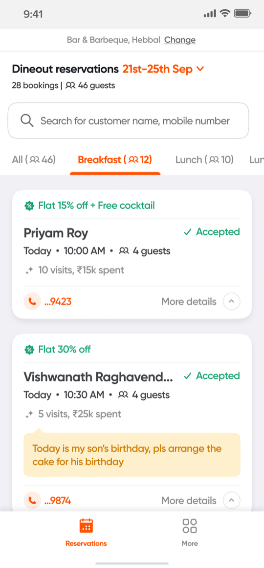
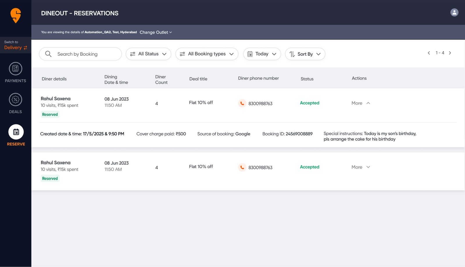
There was no reservations experience on the phone at all. Bookings lived only in a wide desktop table: guest, time, party size, offer, phone, status, and more hidden in each row. I built the mobile version from scratch, bringing over everything that mattered on web, and restructured it, because that table doesn't shrink to fit a phone.
- What comes first
- Out of every column, a manager mid-service needs four things: time, party size, offer and any special request. Those lead each card; everything else is a tap away.
- Grouped by meal
- A flat list of the day becomes breakfast, lunch and dinner tabs, each with a guest count, because that's how the floor is planned.
- Nothing missed
- Requests like a birthday cake are highlighted on the card, not buried in an expanded row.
Digital menu · one tab, four tiles
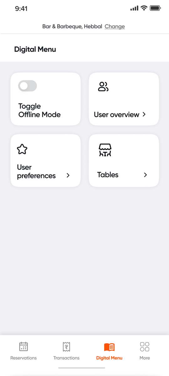
The digital menu is a separate project I worked on, where I designed table management and offline mode (so a busy kitchen can pause orders).
Here, the job was to bring it together. Its controls were scattered across the nav and other screens. Now they all sit in one tab, as four big tiles.
- Before
- Settings scattered across the nav and other screens.
- Now
- One tab: offline mode, orders, preferences and tables.
Transactions · built from scratch
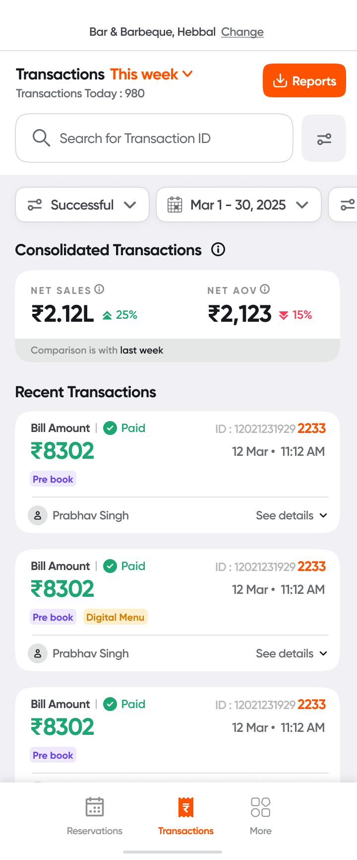
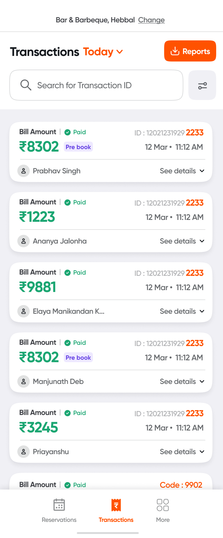
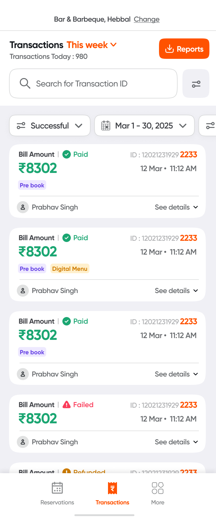
For the first time, restaurants could see every bill paid through Dineout. Servers scan thousands of these, so each row had to say as little as possible.
The one thing I didn't compromise onThe last four digits of the transaction ID, up front. That's what servers match against their own system.
M1 · launch lean
We shipped a small first version with what we already had, so restaurants got value quickly.
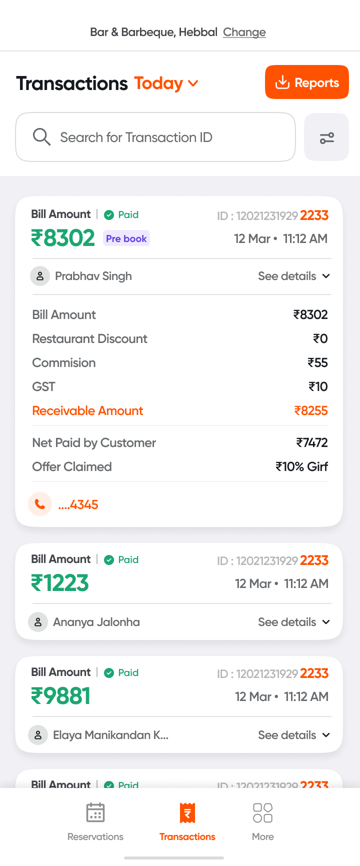
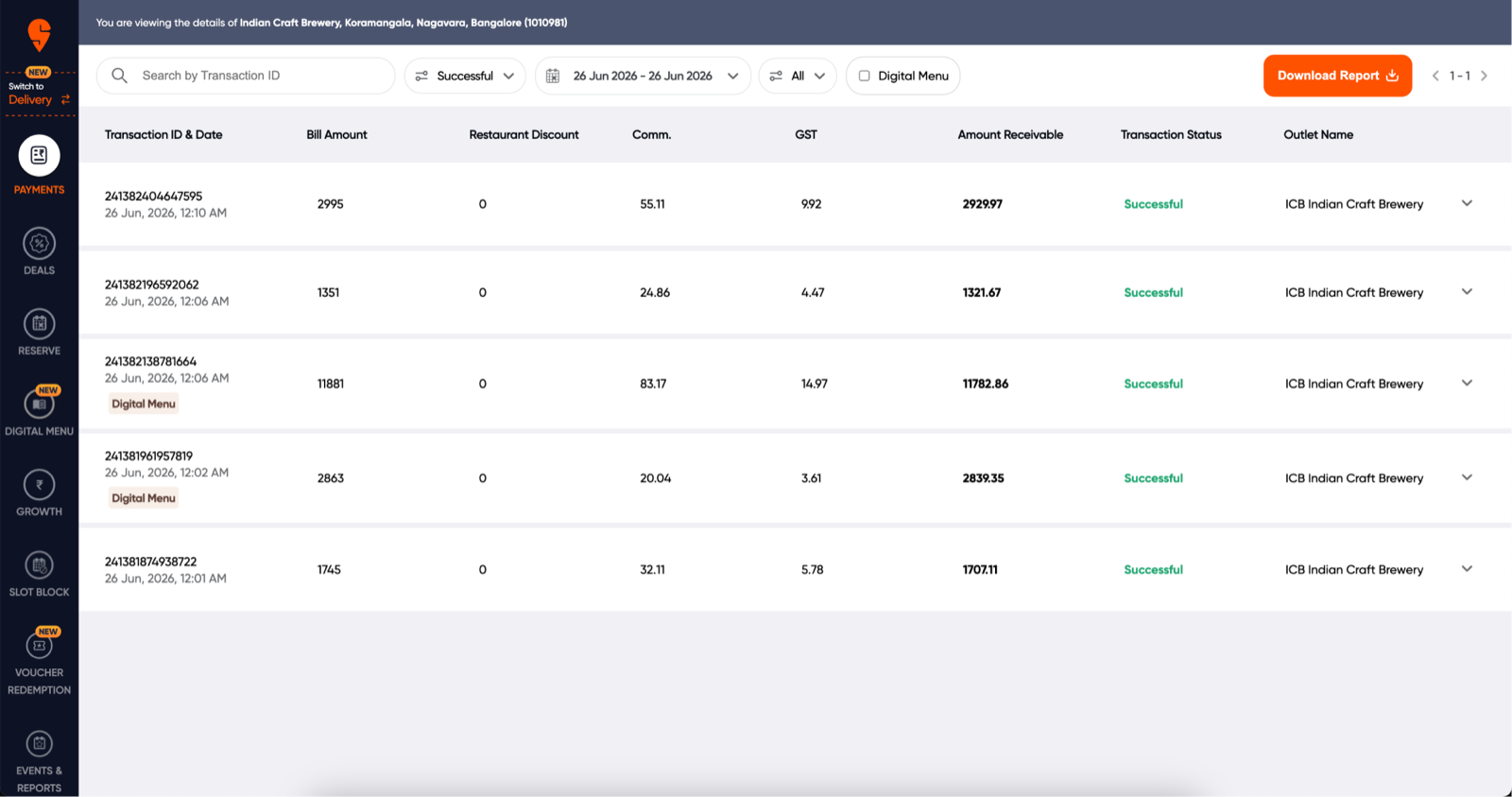
After M1, partners asked for totals too, but only for some people on the team.
M2 · shaped by who's looking
So M2 splits the app by role. Restaurants choose who sees what from the dashboard.
What a row says
- …2233The last 4 digits of the ID, highlighted for matching.
- ₹8,302The bill amount, largest in the row.
- PaidStatus, so failed or refunded ones stand out.
- 12 Mar · 11:12 AMWhen it was paid.
- Prabhav S. · Pre bookThe guest, and tags like Pre book or Digital Menu.
Payouts · from inbox to dashboard
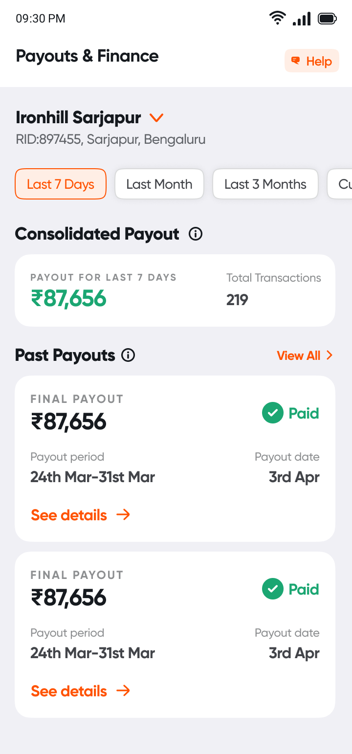
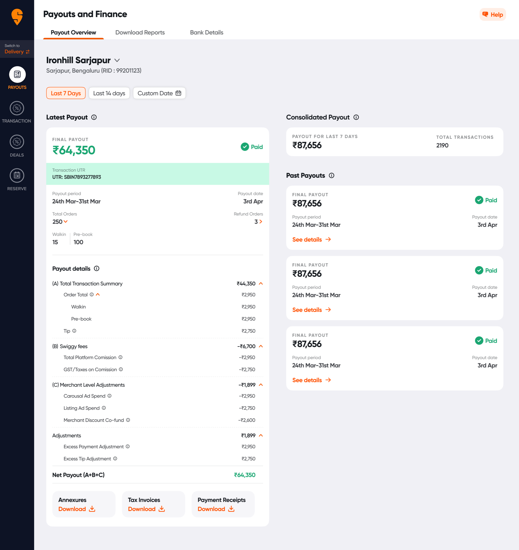
Payouts used to arrive as emails. They come every week or two, so the app shows each cycle clearly, not just one amount.
- 1EarningTransactions add up through the cycle.
- 2Cycle closesWeekly or every 14 days.
- 3SettledA UTR is generated for the transfer.
- 4PaidMoney lands with the restaurant.
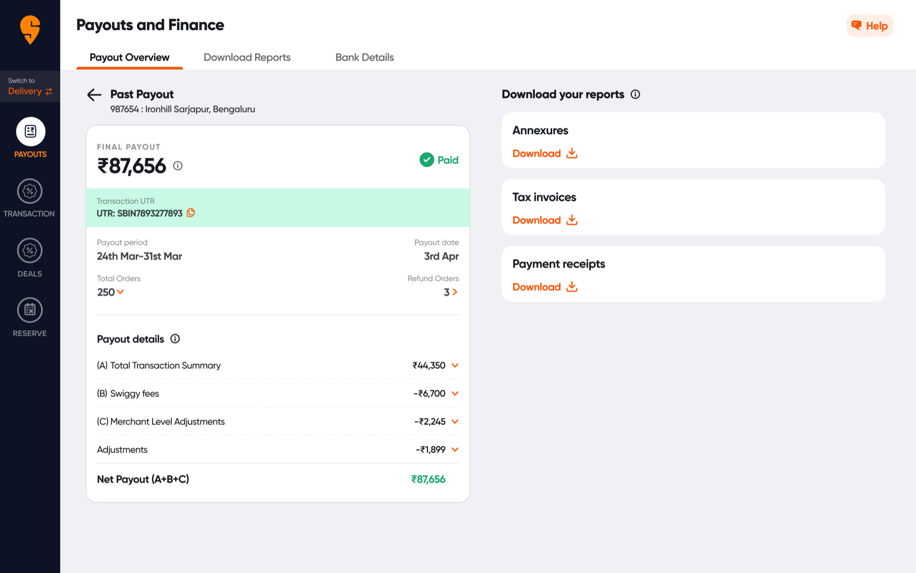
On the phone
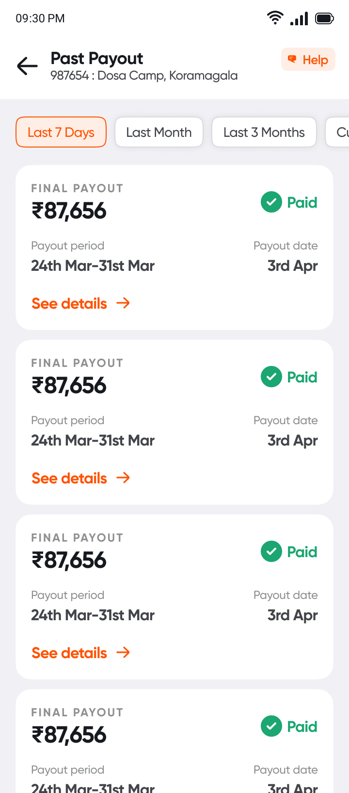
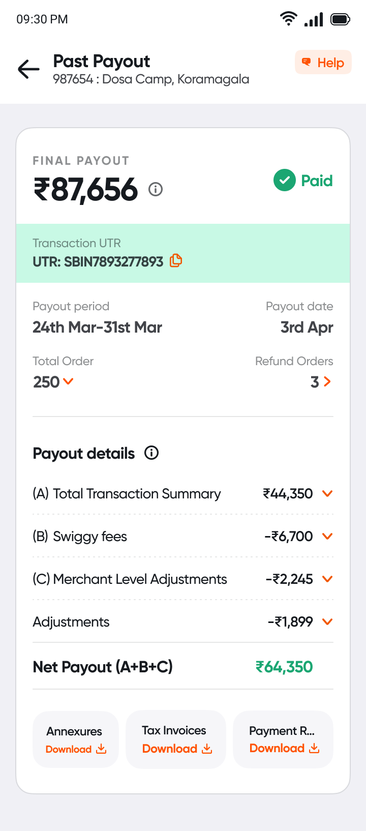
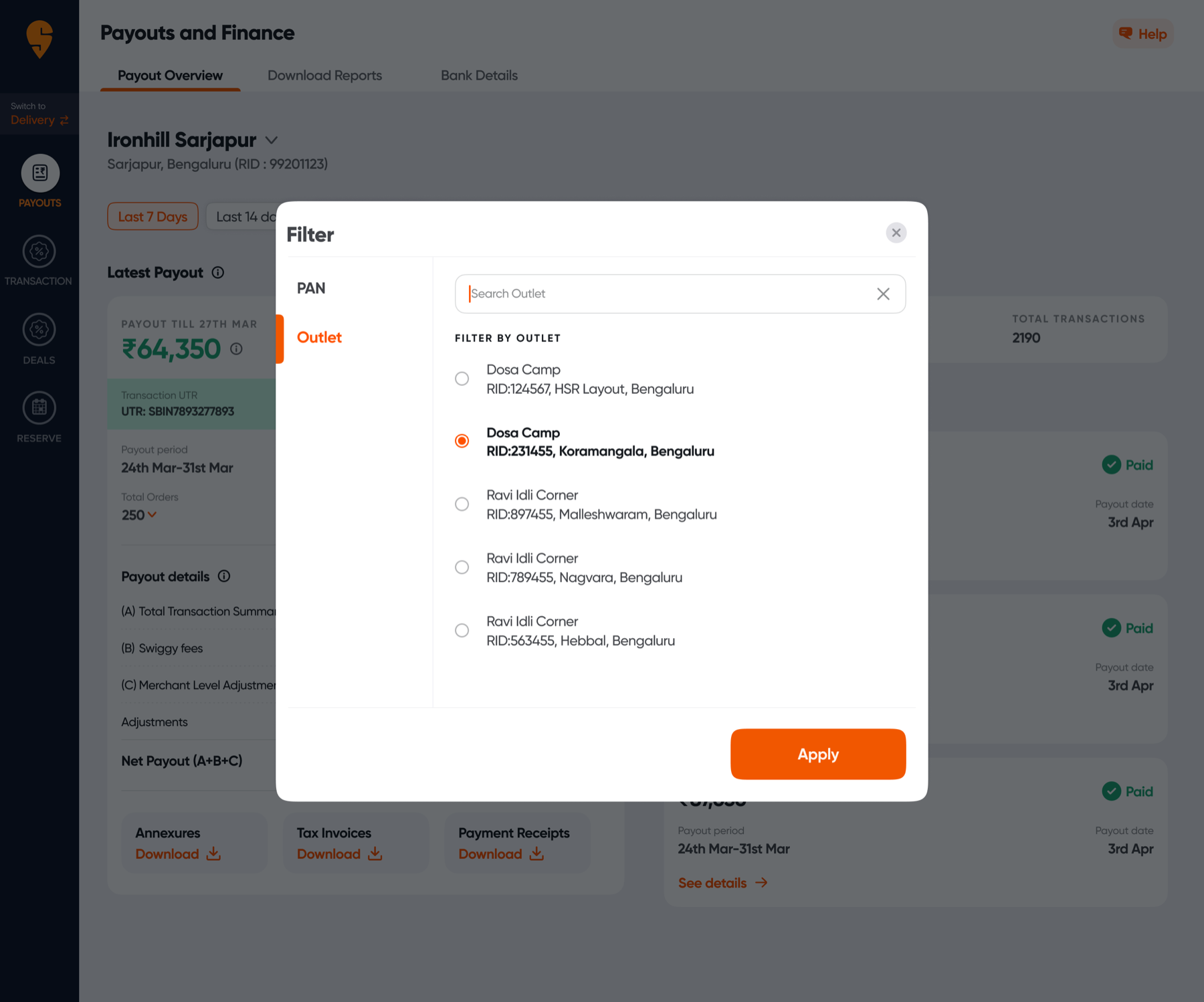
Many outlets, one owner
Many owners run several outlets, sometimes under one PAN, and want to see money both ways.
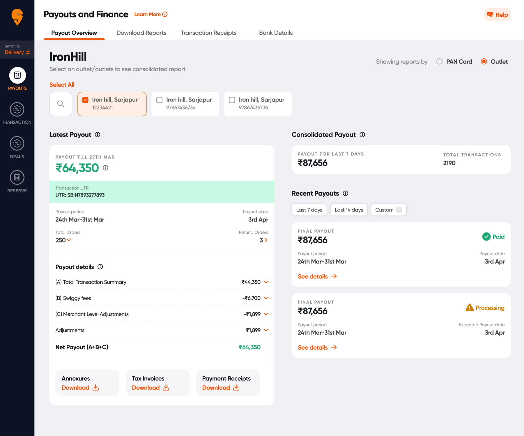
One system
Four tabs, two platforms, one set of building blocks. Learn it on web, and you already know it on the phone.
- Outlet switcherAlways in the header, always in the same place.
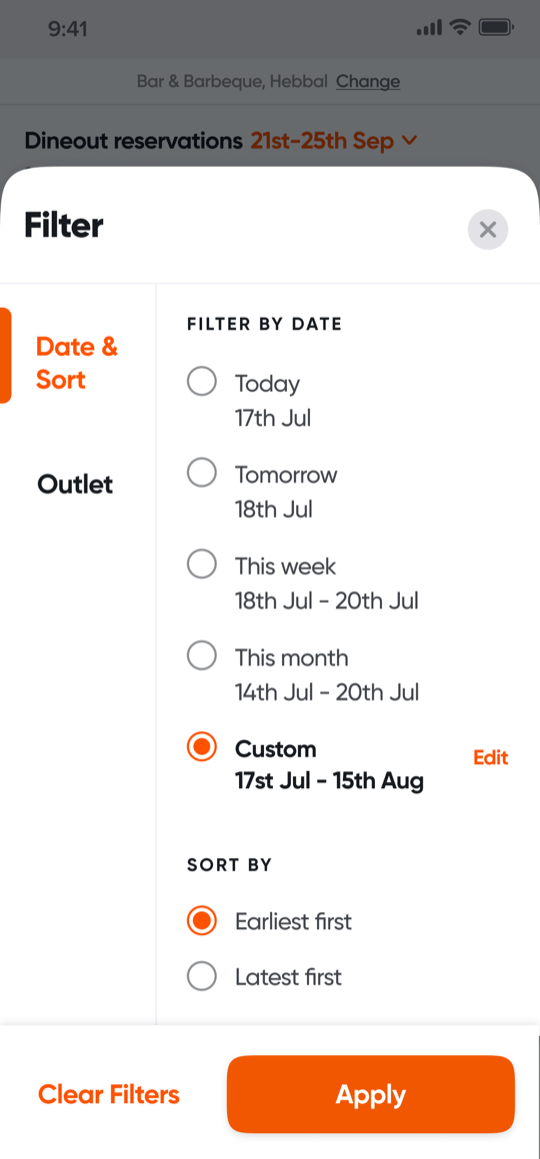
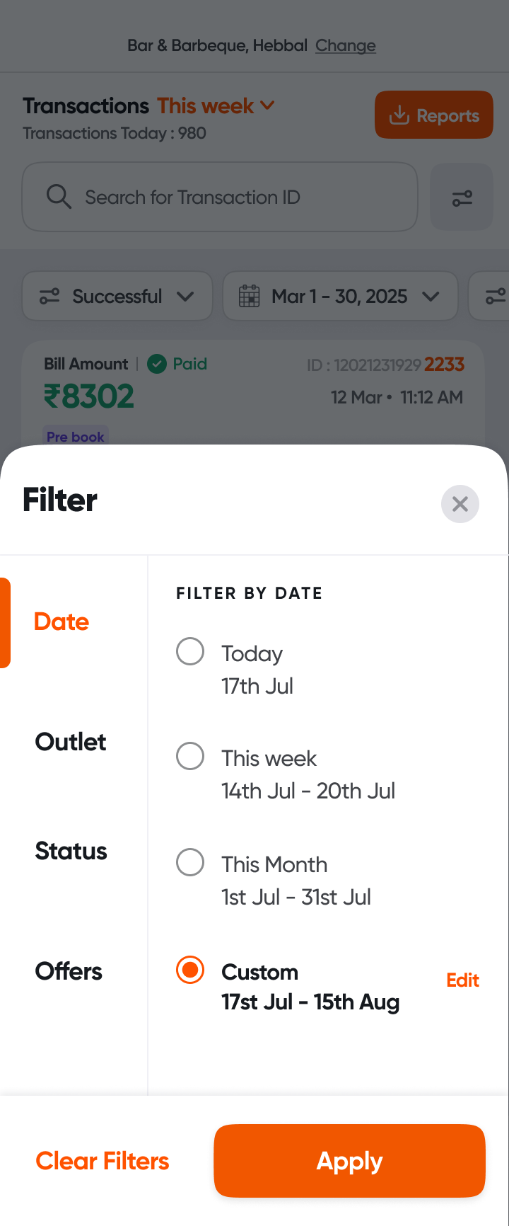
- Date rangeToday, this week, this month, or custom.
- List rowsThe key number first, details a tap away.
- Status chipsPaid, failed, refunded, accepted: one colour language.
- Bottom tabsReservations, Transactions, Digital Menu, More.
Key decisions
- The last four digits come first
- Servers match bills by them, so they stay up front.
- Launch lean, then split by role
- M1 shipped fast. M2 used partner feedback to give owners and staff different views.
- From inbox to dashboard
- Payouts belong where restaurants can check them anytime, not in email.
- Context before the guest arrives
- The offer, party size and special requests come first, so the team can prepare.
- Less in every row
- Rows show only what servers scan for. Full details are a tap away, and on web. Less in the row, a faster list.
Impact · since launch
- 20×Partner app adoption.
- +45%Partner web adoption.
- +15%NPS.
- −50%Product-related NPS detractors.
Restaurants can now see every bill, follow every payout, and run bookings and their digital menu, all in one app. Transactions, Payouts and Reservations on the phone are all new, and the Digital Menu lives in one tab.
What I learned
Designing for people at work is different. A server mid-rush doesn't explore, they match and move on. The most useful thing in a row was four digits.
Shipping small and then listening beat designing everything up front. M2 is better because M1 reached partners first.
And when money is involved, clarity is the kindest thing you can design.
Thanks for reading (or probably just scrolling).