Increased AOV of Digital Menu
Nudging diners to add a little more to every order, with rewards that feel like a treat, not a sales pitch.
In short
- The goalMake each Digital Menu order a little bigger, without forcing it.
- What I triedA gamified reward flow, from six game ideas to a winner, built end to end with Cursor.
- Where it landedA light reward layer beat a full game. It's in build, with an A/B test planned.
The best upsell doesn't feel like one. It feels like the restaurant is treating you.
Digital Menu & AOV
Scan the QR on the table and the restaurant's menu opens on Swiggy. AOV is how much each order is worth. The ask is simple: make the order slightly bigger, without forcing it. More revenue from the same tables, without needing more customers.
“Zyada log lana mushkil hai, par har order ko thoda bada banana smart move hai.”
Reading the moment
It's rarely one person calmly scrolling.
- The table is social
- Friends order together, often from one phone. A nudge has to make sense to the whole table.
- Pace changes with the place
- Cafés are quick, bars order in rounds, fine dining is slow. One design has to respect all three.
- The total is always in view
- The cart bar shows items and total, the most natural place to say what a little more would unlock.
Approaching design
I drifted from what the PMs first asked for and pitched gamification. A plain "add this" prompt feels transactional; a bit of play creates momentum.
- Goal-gradient effect
- “Add ₹X more to unlock” always feels within reach.
- Small, reachable steps
- Rewards unlock one threshold at a time, not one big distant target.
- Reciprocity
- A gift from the restaurant makes the next step feel like an exchange, not a sale.
- Peak–end rule
- When rewards run out, the tone shifts to “You're valued here”.
What the ideal flow looks like
- 01 · Browse
Order as usual.
- 02 · Nudge
“Add ₹X more to unlock a reward.”
- 03 · Unlock
Rewards unlock one at a time.
- 04 · Delight
The last one, through a little game.
Once rewards run out: from “Spend more to earn” to “You're valued here”.
Exploring game ideas
Playful, but still true to Swiggy's design language.
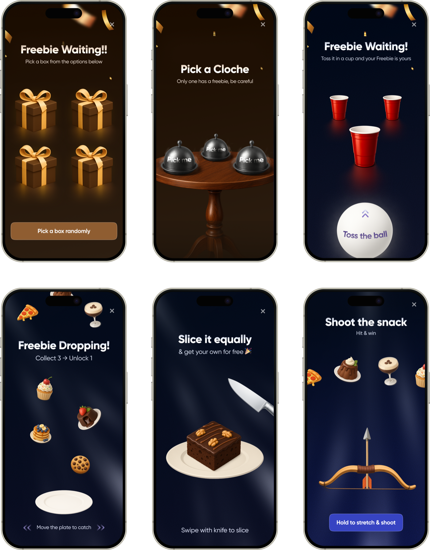
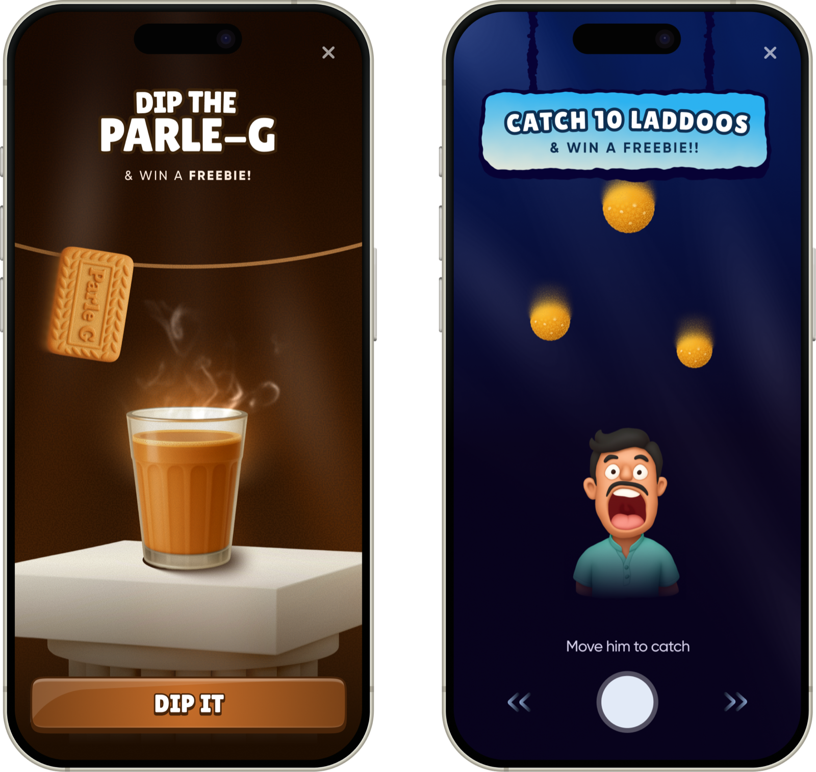
Two stood out: Dip the Parle-G and Catch 10 Laddoos. In-office testing picked the Laddoo game as the most intuitive and fun.
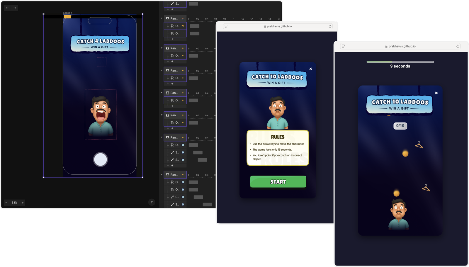
I didn't stop here
A ProtoPie prototype first, then, with tight engineering bandwidth, I built the entire experience myself, using Cursor.
Let's take a pause from the game (like the engineers did)
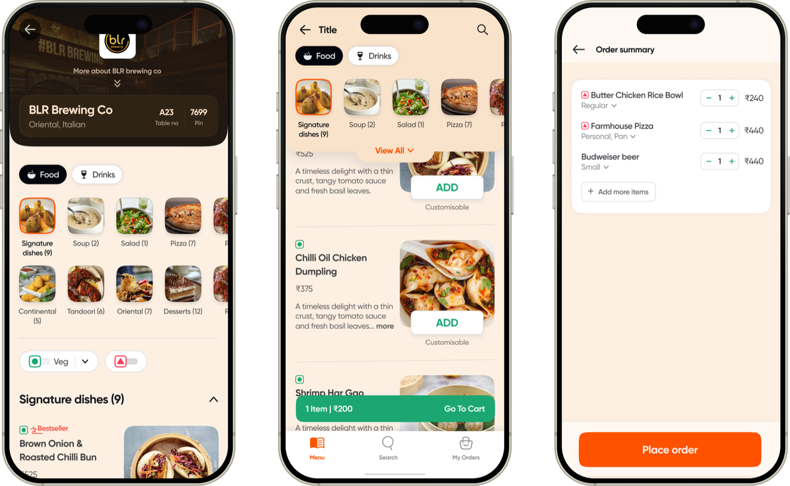
Any upsell has to fit into the three screens people act on: Home, Menu and Cart.
The first flow, with the game
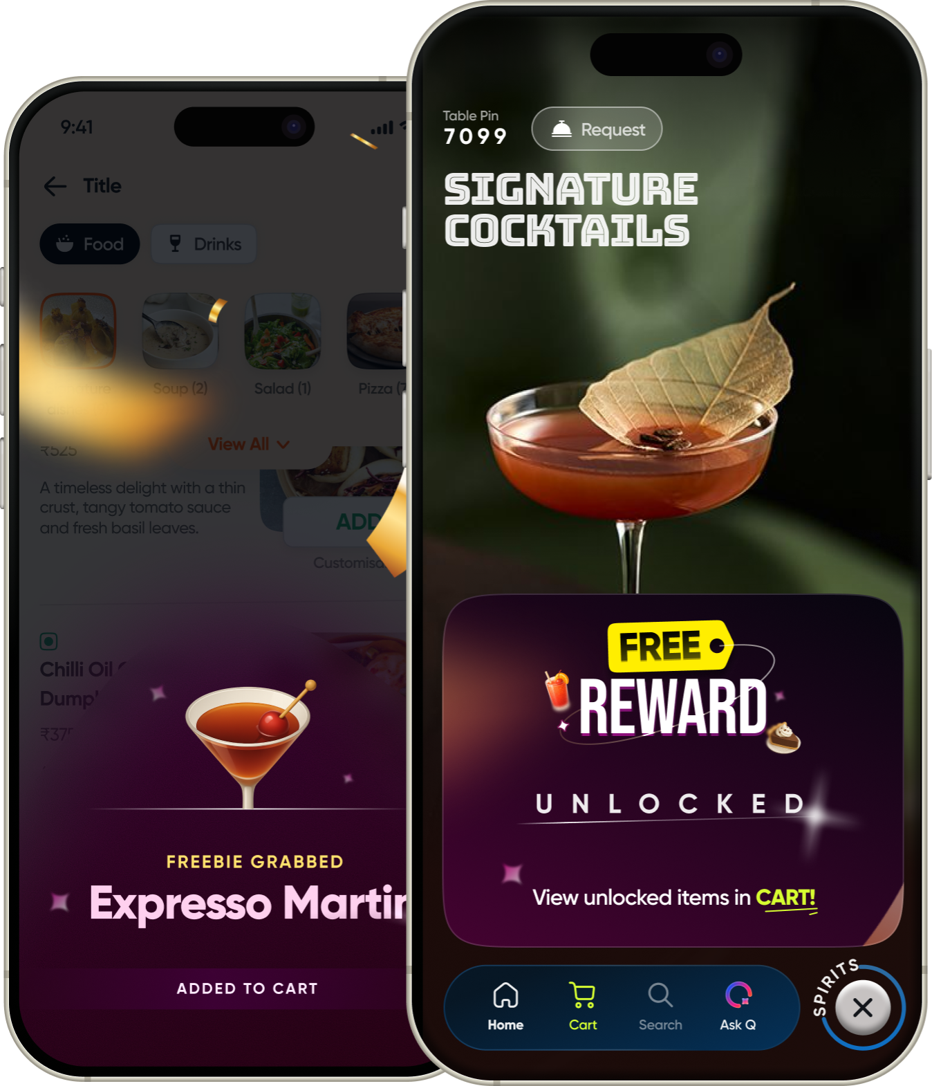
Add ₹X more to unlock a mystery, play, grab your treat.
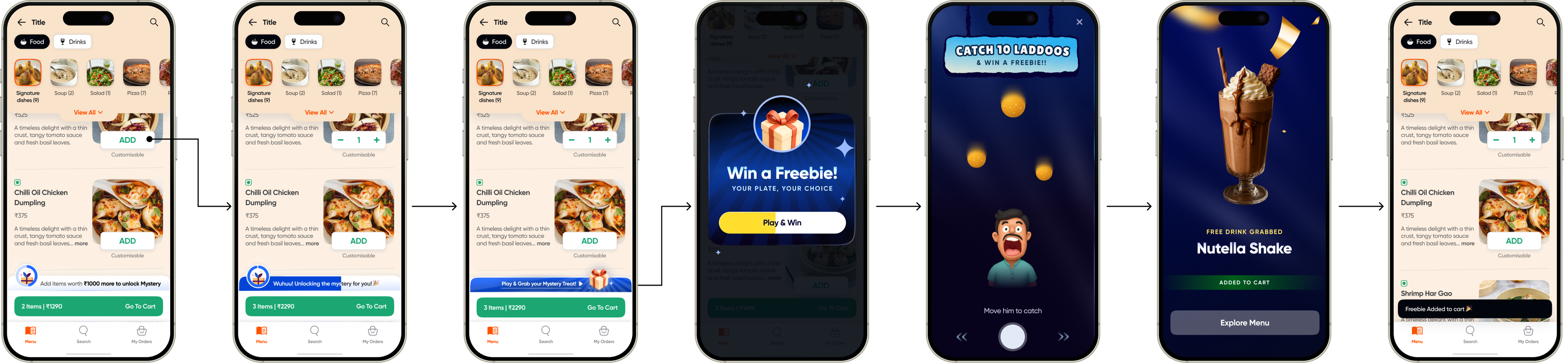
I tested it across teams. Guess what?People ordering quickly in a café didn't want to play a game to get a reward.
The final flow
Built into the cart bar: add ₹X more, a light “Woohoo! Free reward unlocked”, and you never leave the menu. The game moves to an A/B test.

Key decisions
Should the menu show every reward upfront?
No. The menu stays about the food. Rewards show up in the cart, where they're relevant and you can act on them.
Two ways we tried showing rewards
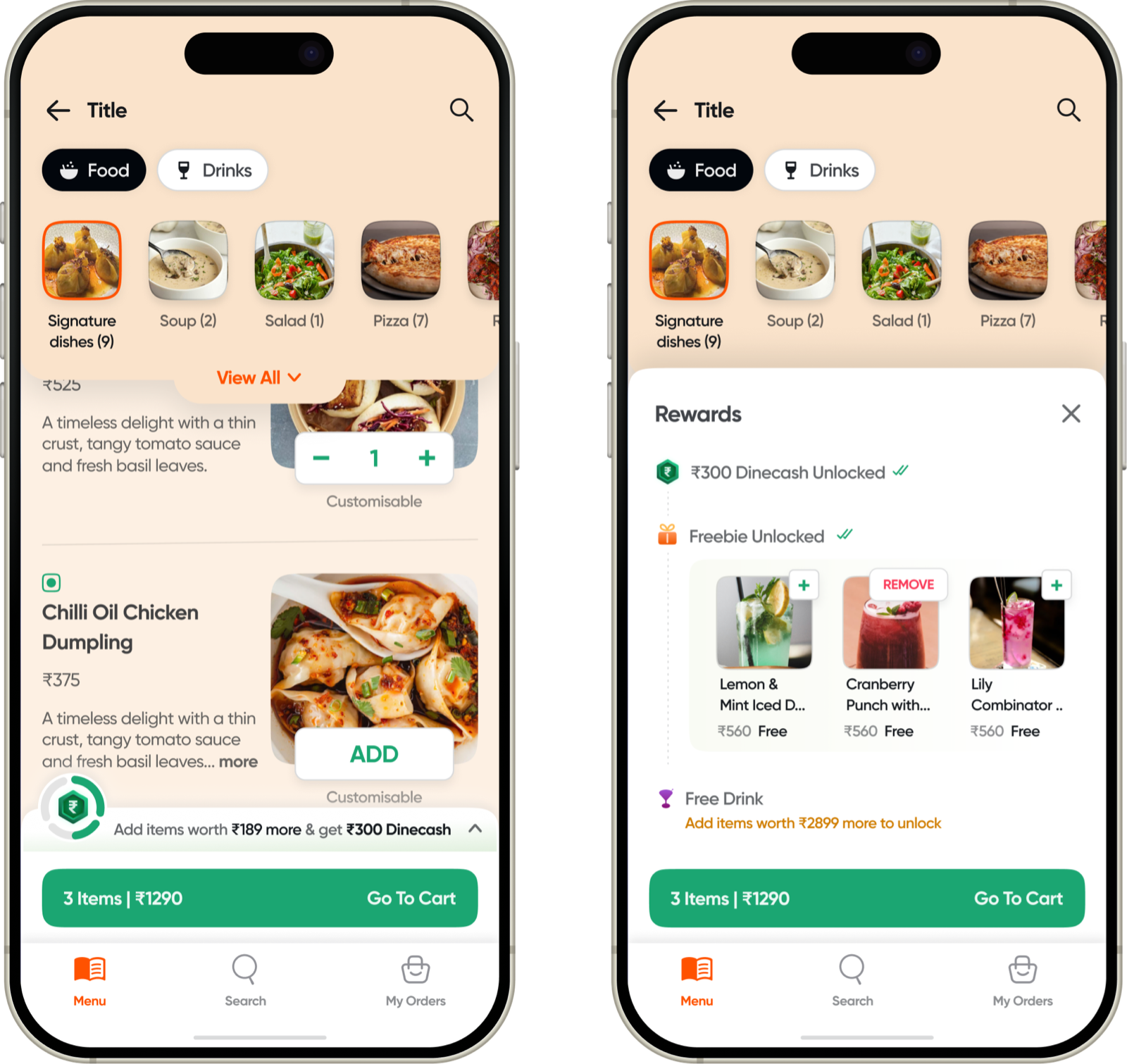
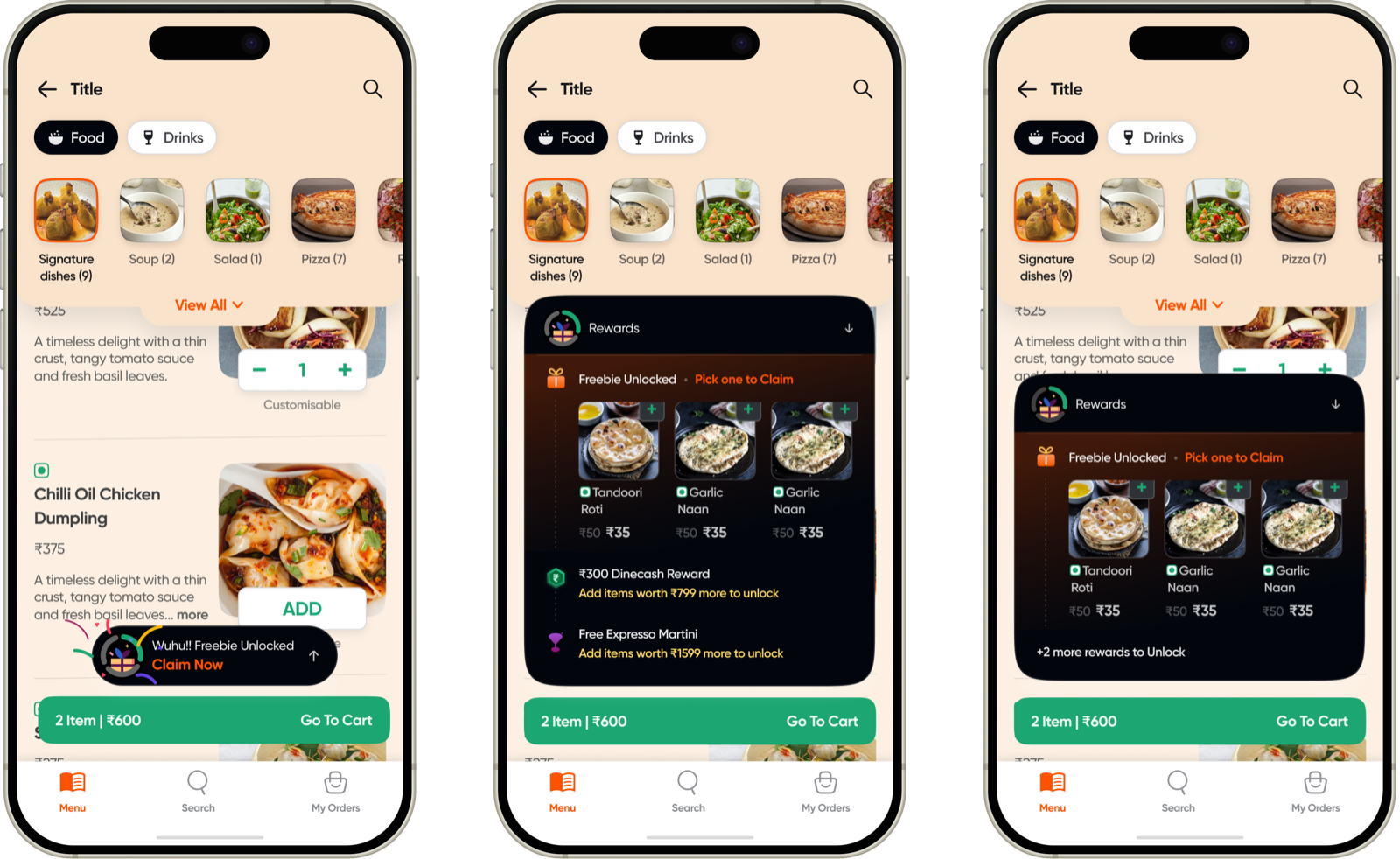
Why
- Less to take inA wall of rewards competes with the dishes.
- Rewards stay in reachFar-off rewards feel worth less.
- Money stays in the backListing spend targets makes people price-conscious.
- The surprise stays specialAlways on screen, it feels like a coupon.
Should people claim rewards on the menu?
No. They claim in the cart.
Why
- Accurate thresholdsOnly the cart knows the final total.
- One job per screenChoose on the menu, settle up in the cart.
- No distractionClaiming mid-browse pulls you out of ordering.
- Food stays the goalClaim too early and the reward becomes the point.
How we'll read the A/B
- ControlToday's Digital Menu.
- Variant AThe light flow on the cart bar.
- Variant BThe same, with the Laddoo game for the last reward.
AOV first, with guardrails on order time, cart drop-off and freebie cost. A bigger order isn't a win if ordering feels slower or salesy.
In build now. I'll update this once the numbers come in!
Reflections
- Small nudges > big banners.
- Timing matters a lot.
- AOV is about making the right things easy to add.
- Knowing what not to show matters as much.
Thanks for reading (or probably just scrolling).